
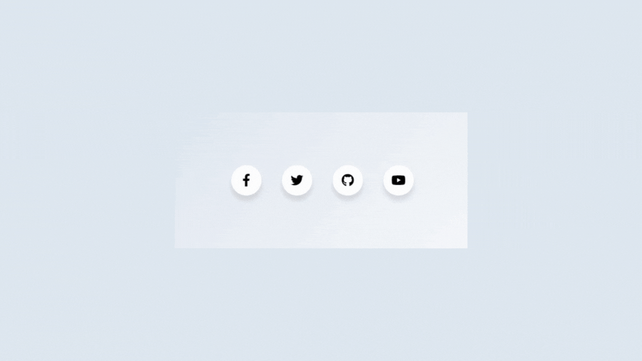
Social media icons are a staple of web design. Most of the time, designers and developers just settle for a simple button with the social icon slapped on it. But let’s get real — basic and standard icons are boring. They’re everywhere and nothing makes them stand out.
In this tutorial, we are going to jazz it all up a little with some hover tooltips.
Here is what we will be making:

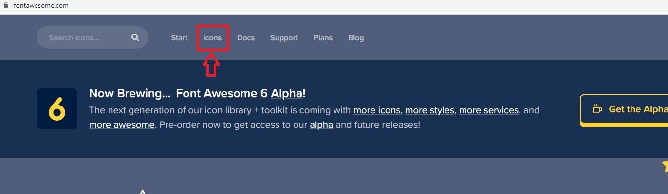
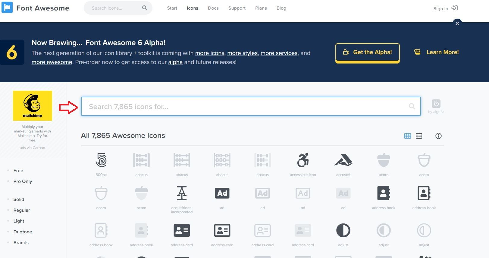
To get the base shapes for the icons, we will be using the free version of font awesome. There are multiple ways to get font awesome files into your projects, but for this tutorial, I used the CDN. Here is the font awesome CDN link that I used:
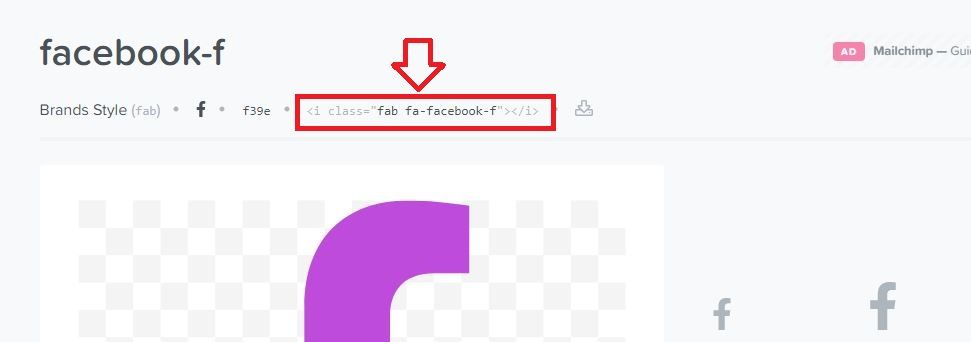
<link rel="stylesheet" href="https://cdnjs.cloudflare.com/ajax/libs/font-awesome/5.15.3/css/all.min.css" />The HTML for this is pretty simple and follows a icon , tooltip , span structure. You can add other social network icons as well if you want. To get other icons, go to fontawesome.com and navigate to the icon tab. Use the search function to find the specific icon you want.
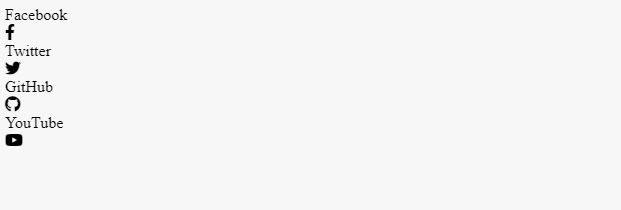
In the HTML below, there is a wrapper class to keep everything contained. Here is the HTML for your hover over tooltip social navigation:
<div class="wrapper">
<div class="icon facebook">
<div class="tooltip">Facebook</div>
<span><i class="fab fa-facebook-f"></i></span>
</div>
<div class="icon twitter">
<div class="tooltip">Twitter</div>
<span><i class="fab fa-twitter"></i></span>
</div>
<div class="icon github">
<div class="tooltip">github</div>
<span><i class="fab fa-github"></i></span>
</div>
<div class="icon youtube">
<div class="tooltip">YouTube</div>
<span><i class="fab fa-youtube"></i></span>
</div>
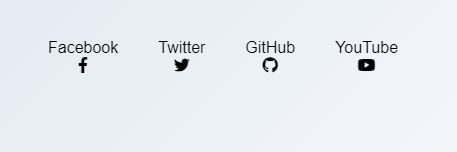
</div>Here is what it looks like without any CSS applied:
Let’s get on with making it look like how we want it to look with CSS. This next part is not compulsory but is there to make things look a bit tidier if you’re just following along to this tutorial. You can also set your own font-family. It doesn’t have to be Arial. The CSS below mostly just centers everything on the page and gives a nice light grey-ish blue gradient background.
*{
  font-family:'Arial', san serif;
}
html, body{
  display:grid;
  height:100%;
  width: 100%;
  place-items:center;
  background: linear-gradient(315deg, #ffffff, #d7e1ec );
}
The next step is to put all your icons inline with inline-flex.
.wrapper{
  display:inline-flex;
}
Here is what your social navigation looks like now:

The next thing we’re going to do is set the dimensions of your icon so it doesn’t look so squished, center it, and relatively position it so we can use each relative box as the base coordinate reference for position:absolute for the tooltips.
.wrapper .icon{
margin: 0 20px;
cursor:pointer;
display:flex;
align-items:center;
justify-content:center;
flex-direction:column;
position: relative;
z-index:2;
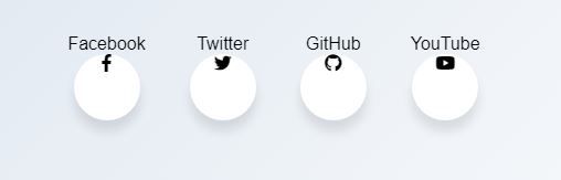
}Here is what it looks like now:
Let’s style our social icons so it sits nicely in a circle. To do this, we are going to target the span portion because it’s the thing that holds our social icons. The circle is achieved through border-radius and we give it a little bit of a box-sahdow to give it dimension. Here, we also set a cubic-bezier transition to give it a snappy animation when we hover over it.
.wrapper .icon span{
position:relative;
z-index:2;
height: 60px;
width: 60px;
display:block;
background: #fff;
box-shadow: 0 10px 10px rgba(0,0,0,0.1);
border-radius:50%;
text-align:center;
transition: all 0.4s cubic-bezier(0.68, -0.55, 0.265, 1.55);
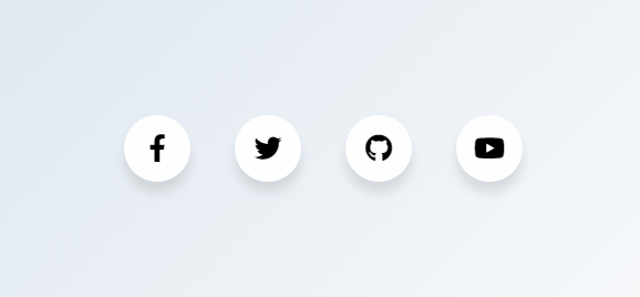
}Here is what our social navigation looks like now:
The next step is to center our social icons and make them look a bit bigger. However, instead of doing funky things with margins and padding, we are going to change the font-size instead and set the line-height to the same height of our span. This will work because font awesome icons are actually fonts, which makes it possible to treat it like one. Using line-height instead of margin and padding to shift the icons into place will ensure that your span dimensions don’t get affected.
.wrapper .icon span i{
font-size:25px;
line-height:60px;
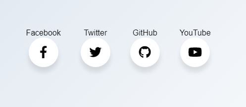
}Here is what our social icons look like now:
Now that we have the base of our social icons completed, let’s get started with the tool tip portion of our effects. To do this, we are going to target .wrapper .icon .tooltip. We’re going to move it out of the flow with position:absolute and position it on top of our social icons. We are also going to set the background color, give it a little space through padding , and round the corners with border-radius. The opacity is set to 0 for the interim because we want to transition it to 1 when a social icon is hovered over. The font color is set to white because we are going to have custom colors for each social media.
.wrapper .icon .tooltip{
  position:absolute;
  top:0px;
  background: #fff;
  box-shadow: 0 10px 10px rgba(0,0,0,0.1);
  font-size: 20px;
  padding: 10px 18px;
  border-radius: 25px;
  color:white;
  opacity:0;
  pointer-events: none;
  transition: all 0.4s cubic-bezier(0.68, -0.55, 0.265, 1.55);
}
Here is the CSS for when .icon is hovered over. It also sets the position so that it ‘pops up’ rather than just appearing.
.wrapper .icon:hover .tooltip{
  opacity:1;
  pointer-events: auto;
  top:-70px;
}
Here is what your social navigation looks like with the hover effect:
Right now, the hovered-over pill is missing the tooltip part. To do this, we are going to leverage :before . To do this, we will create a small box and rotate it by 45deg via transform . We are also going to give our icon a hover effect as well by changing the color from black to white.
.wrapper .icon .tooltip:before{
  position:absolute;
  content:"";
  height:15px;
  width:15px;
  bottom:-8px;
  left:50%;
  transform: translateX(-50%) rotate(45deg);
}
.wrapper .icon:hover span,
.wrapp .icon:hover .tooltip{
  text-shadow: 0px -1px 0px rgba(0,0,0,0.4);
}
.wrapper .icon:hover span{
  color: #fff;
}
The final step is to add the social media colors for each icon set.
.wrapper .facebook:hover span,
.wrapper .facebook:hover .tooltip,
.wrapper .facebook:hover .tooltip:before{
  background:#3B5999;
}
.wrapper .twitter:hover span,
.wrapper .twitter:hover .tooltip,
.wrapper .twitter:hover .tooltip:before{
  background:#46C1F6;
}
.wrapper .github:hover span,
.wrapper .github:hover .tooltip,
.wrapper .github:hover .tooltip:before{
  background:#333;
}
.wrapper .youtube:hover span,
.wrapper .youtube:hover .tooltip,
.wrapper .youtube:hover .tooltip:before{
  background:#de463b;
}
And there you have it!

Here are all the HTML and CSS in one place:
The CDN:
<link rel="stylesheet" href="https://cdnjs.cloudflare.com/ajax/libs/font-awesome/5.15.3/css/all.min.css" />The HTML:
<div class="wrapper">
    <div class="icon facebook">
      <div class="tooltip">Facebook</div>
      <span><i class="fab fa-facebook-f"></i></span>
    </div>

    <div class="icon twitter">
      <div class="tooltip">Twitter</div>
      <span><i class="fab fa-twitter"></i></span>
    </div>
<div class="icon github">
      <div class="tooltip">github</div>
      <span><i class="fab fa-github"></i></span>
    </div>
<div class="icon youtube">
      <div class="tooltip">YouTube</div>
      <span><i class="fab fa-youtube"></i></span>
    </div>
</div>
And the CSS:
*{
  font-family:'Arial', san serif;
}
html, body{
  display:grid;
  height:100%;
  width: 100%;
  place-items:center;
  background: linear-gradient(315deg, #ffffff, #d7e1ec );
}
.wrapper{
  display:inline-flex;
}
.wrapper .icon{
  margin: 0 20px;
  cursor:pointer;
  display:flex;
  align-items:center;
  justify-content:center;
  flex-direction:column;
  position: relative;
  z-index:2;
}
.wrapper .icon span{
  position:relative;
  z-index:2;
  height: 60px;
  width: 60px;
  display:block;
  background: #fff;
  box-shadow: 0 10px 10px rgba(0,0,0,0.1);
  border-radius:50%;
  text-align:center;
  transition: all 0.4s cubic-bezier(0.68, -0.55, 0.265, 1.55);
}
.wrapper .icon span i{
  font-size:25px;
  line-height:60px;
}
.wrapper .icon .tooltip{
  position:absolute;
  top:0px;
  background: #fff;
  box-shadow: 0 10px 10px rgba(0,0,0,0.1);
  font-size: 20px;
  padding: 10px 18px;
  border-radius: 25px;
  color:white;
  opacity:0;
  pointer-events: none;
  transition: all 0.4s cubic-bezier(0.68, -0.55, 0.265, 1.55);
}
.wrapper .icon:hover .tooltip{
  opacity:1;
  pointer-events: auto;
  top:-70px;
}
.wrapper .icon .tooltip:before{
  position:absolute;
  content:"";
  height:15px;
  width:15px;
  bottom:-8px;
  left:50%;
  transform: translateX(-50%) rotate(45deg);
}
.wrapper .icon:hover span,
.wrapp .icon:hover .tooltip{
  text-shadow: 0px -1px 0px rgba(0,0,0,0.4);
}
.wrapper .icon:hover span{
  color: #fff;
}
.wrapper .facebook:hover span,
.wrapper .facebook:hover .tooltip,
.wrapper .facebook:hover .tooltip:before{
  background:#3B5999;
}
.wrapper .twitter:hover span,
.wrapper .twitter:hover .tooltip,
.wrapper .twitter:hover .tooltip:before{
  background:#46C1F6;
}
.wrapper .github:hover span,
.wrapper .github:hover .tooltip,
.wrapper .github:hover .tooltip:before{
  background:#333;
}
.wrapper .youtube:hover span,
.wrapper .youtube:hover .tooltip,
.wrapper .youtube:hover .tooltip:before{
  background:#de463b;
}