Pure Dropdown CSS Navigation Bar From Scratch

Pure Dropdown CSS Navigation Bar From Scratch

Dropdown menus are inescapable when it comes to front-end development. At some point, you’re going to encounter them.

While most CSS frameworks automatically handle this for you, sometimes you just need to do it yourself.

But the question is — how?

For those who are new to CSS or just have a working basic knowledge of it, this can feel like a trap. You can float, you can inline display, you can do a whole bunch of things, but you just can’t seem to get things to drop down properly.

Here’s a quick guide on how it all works and why it works, with guided code samples.

Or if you’re just after the final code recipe, you can just scroll to the bottom and grab it there.

But before we begin, we need to get solid on a few concepts first.

Decrypting Relative and Absolute Positioning

Relative and absolute positioning in CSS is one of those annoying concepts that new front-end developers often struggle with.

We all know that it can move things around, but how does it work?

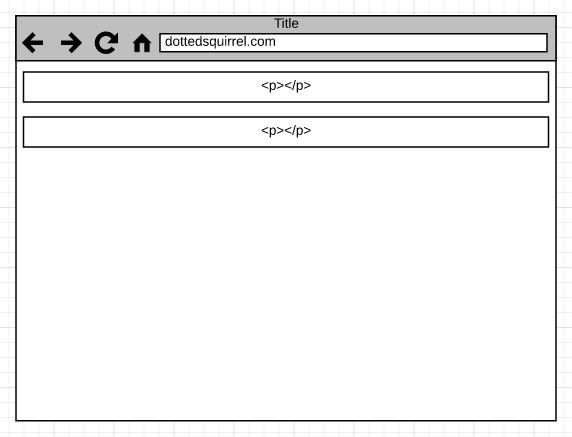
Let’s start with relative and the code below:

<p>Some text here</p>
<p>Some text here again</p>

When it gets rendered, each tag’s boundary scope looks something like this:

Most elements are blocks by default, which means it stretches to the edge of the screen. This is why the <p> tags stretch all the way to the edge of your browser.

When we apply relative positioning to an element, any coordinate properties such as top , left , right , andbottom will move that element from where it currently sits on the screen.

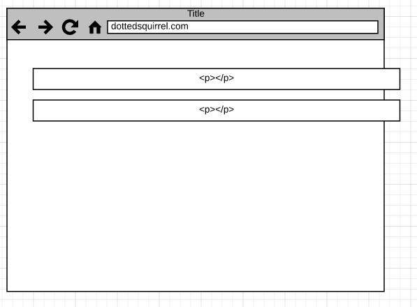
Let’s say we want to apply relative to our p tags, and move it to the right and down. We would write something like this:

p { position:relative; left: 50px; top: 50px; }

This will result in the following output:

The p blocks are moved accordingly (50px from the left and 50px from the top). The relativeness of its original point is based on the screen.

A thing to note is that when you use relative, it doesn’t move your elements out of the natural block flow. This means that if you have a div container around your p tags and apply relative to it, it won’t cause the div to collapse.

It’ll end up moving the unit as a whole, in an as-in manner. It’s relative to the original position and will nudge it around based on where you want it to go.

For example, your HTML looks something like this:

<div> 
   <p>Some text here</p>
   <p>Some text here again</p>
</div>

And you CSS looks something like this:

div{
	position:relative; left: 50px; top: 50px; 
   }

Your visual output would be something like this:

So where does absolute positioning fit in?

Absolute positioning is most powerful when it’s used on a child element. If you use it on a parent element, its coordinate reference is based on your window.

For example, imagine you had the following HTML:

<p>Some text here</p>
<div>
    <p>Some text here</p>
    <p>Some text here again</p>
</div>
<p>Some text here</p>

This is what the flow will look like under normal circumstances:

If you were to apply position:absolute to your div and then move it around, the original coordinates wouldn’t be based on the corner point of your current position. Rather, they would be based on the top left corner of your window.

In addition to this, the entire div block would be moved out of your natural block flow. It’ll sit on top of everything else as if it exists on its own plane. The width also collapses to the width of the largest element inside (which has also collapsed as well).

So it ends up looking like this:

Suppose you start moving it around, and your CSS code looks something like this:

div {
	position:absolute; top:0; left:10px; 
}

Rather than placing the div based on its current position, the starting coordinates would begin at the top left corner and go from there.

In the end, it looks something like this:

How does the CSS relative and absolute positioning combination work?

Well, if you think about it, relative keeps the original positioning static without taking it out of the block flow. absolute lifts the element off the page and moves it in accordance with the original container coordinates.

When there is no container, the window is equivalent to the parent container.

Suppose you have a CSS combination that looks something like this:

div {position:relative;}
div p {position: absolute; top: 50px; }

You’d end up with something like this:

The original div container stays put while the p tags stack on top of each other because they’ve been moved from the normal flow, into their own plane, and are placed with the div left top corner as the starting point.

The div's height also collapses. Why?

Because there’s technically nothing sitting in it. absolute took the p tags out from the normal flow, so the document is under the impression that there’s nothing inside — hence the collapse. The way around this is to set a width and height on the div if you really need it to fill up space for background displays, etc.

So that’s one concept towards understanding how pure CSS dropdown menus work. Let’s move on to the next one.

block, inline-block, inline

Every HTML element has a default display value, and this value is often block.

There are a few inline elements by default. Here’s a quick list of which is which by default.

block element by default

<address> <article> <aside> <blockquote> <canvas> <dd> <div> <dl> <dt> <fieldset> <figcaption> <figure> <footer> <form> <h1> to <h6> <header> <hr> <li> <main> <nav> <noscript> <ol> <p> <pre> <section> <table> <tfoot> <ul> <video>

inline element by default

<a> <abbr> <acronym> <b> <bdo> <big> <br> <button> <cite> <code> <dfn> <em> <i> <img> <input> <kbd> <label> <map> <object> <output> <q> <samp> <script> <select> <small> <span> <strong> <sub> <textarea> <time> <tt> <var>

f you take a look at the inline list, they’re usually things that involve further decorating of something that is already sitting inside a block element, and it makes no sense for them to be a block.

But what is a block? What is inline? and what is inline-block?

A block is simply an element whose width extends to the edge of the parent container. When there is no parent container, the window acts as the equivalent of all reference points.

For example, suppose we had the following HTML:

<div class="half-size">
 <p> some text </p>
</div>
<p> just another random text </p>

And suppose your CSS looks something like this:

.half-size { width: 50%; }

Your visual output would look something like this:

inline is when the width only goes as far as the actual content and only takes up as much space as it needs. For example, the a tags can be woven through p tags without disrupting the flow.

<p>Hello, I'm <a href"#"> Tibbers</a>, pleasure to meet you.</p>

inline-block is a mix of both worlds.

It can sit inline within a block element. The major difference between inline-block and inline is that inline has the equivalent margin and padding of 0 because it only takes up the space it needs. In contrast, inline-block respects the top and bottom margins and padding.

Why is this important?

Because browsers have default settings for all elements. This, in turn, also includes spacing.

So when you use inline-block, you’re telling it to apply the top and bottom heights.

inline-block comes in handy for things like a tags sitting inside of li.

For example, you have the following code:

<ul>
  <li><a href"#">Link 1</a></li>
  <li><a href"#">Link 2</a></li>
</ul>

And you want it to look something like this:

But in reality, it currently looks like this:

What do you do?

You put your li tag as inline-block:

li, a {display:inline-block;}

And it will produce something like this:

Side note: The padding in front of the links is actually at the ul level, and you can get rid of it by setting margin:0;.

The Pseudo :hover

The pseudo :hover is the final concept required to construct a pure CSS dropdown menu.

Why is this important?

Because it’s a state-based pseudo-class. What is a state-based pseudo-class? It’s basically a state description that attaches to the main selector. Here’s a table I’m borrowing from another article I wrote:

When you use something like p:hover, you can add additional styling based on when the p tag has a move hovered over it.

There isn’t much to this, but it’s a critical part of constructing our pure CSS dropdown menu — which, in theory, we should be able to do using these three key concepts.

Putting It All Together

Let’s start with a simple, single-level navigation bar. Your starter HTML code looks something like this:

<div class="simple">
    <ul>
      <li><a href="#">Item 1</a></li>
      <li><a href="#">Item 2</a></li>
      <li><a href="#">Item 3</a></li>
    </ul>
  </div>

In its unaltered form, it looks something like this:

We want our final result to look less ugly and to transform it into something like this:

If we look at the HTML, there are essentially three things you need to style: ul , li, and a.

In this context, .simple is a reference point to help keep your code separated from the rest. This means that any styling applied under .simple won’t impact other elements on your page that are not sitting inside the div.

To get rid of the bullet points created by li, remove the padding created for the bullet points to sit, put everything on the same line, and remove the default underline on a, we’re going to apply the following code:

.simple ul {padding:0;}
.simple li { display:inline-block; }
.simple a { text-decoration:none; }

With these three simple modifications, we now have something like this:

To make it look prettier and less 90s HTML, we’re going to add some padding, background color, and change the font color.

.simple ul {background:#0d47a1;}
.simple li { display:inline-block; }
.simple a { text-decoration:none; color:white; padding:15px; }

Why do we add padding on a? Because we are defining the element that has the link in it. That’s why we don’t do it in li or ul.

However, you’d notice that when you do this, the blue background doesn’t seem to be quite right.

However, the a element is covering the right amount of space. We can see this if we put a border around it.

However, the a element is covering the right amount of space. We can see this if we put a border around it.

.simple a {display:block;}

Now that we’re almost done with the first level, let’s add some hover and transition effects using our pseudo-class :hover:

.simple a:hover{
  background:#e3f2fd;
  color:black;
  transition:0.2s all linear;
}

.simple a{ transition:0.2s all linear; }

Transition at :hover tells the view to give a visual delay of 0.2 seconds when the mouse moves over the link, and the transition at the normal a tag handles the transition out.

The transition itself isn’t a compulsory aspect but is a nice feature to have.

Now, for the first-level pure CSS dropdown

We’re going to add our first dropdown.

Here is the sample follow-along HTML:

<div class="simple dropdown">
    <ul>
      <li>
        <a href="#">Item 1</a>
        <ul>
          <li><a href="#">Sub Item</a></li>
          <li><a href="#">Sub Item</a></li>
          <li><a href="#">Sub Item</a></li>
        </ul>
      </li>
      <li><a href="#">Item 2</a></li>
      <li><a href="#">Item 3</a></li>
    </ul>
  </div>

Everything we’ve done in .simple is applied. Now we’re going to focus on the .dropdown part.

I’ve separated them out as separate classes so you can see the progression and how each section of the pure CSS dropdown works. In theory, you can just put them under the same class.

Based on the CSS above and new HTML, your menu navigation looks something like this:

This is where your position relative and absolute comes in handy.

First, we’re going to make the ul relative . Why? Because that’s going to be our base container.

Then we’re going to make the ul that’s a child of li absolute in order to remove it from the flow.

Here’s the sample CSS:

.dropdown ul{ position:relative;  }
.dropdown li > ul { position:absolute; background:#1565c0; }

The background color for the ul child is so you can see where it’s moved to and how it got removed from the original flow.

If you’re unfamiliar with how sibling selectors work (that is, this symbol >), you should check out the first part of The Ultimate Visual Guide to CSS Selectors

Now, we want to stack the sub-items rather than have them sitting next to each other.

You can do this by selecting the ul li child of the target li:

.dropdown li > ul li{ display:block; }

This will lead to this outcome:

Now we want to hide the dropdown. We can do this via display:none when there’s no mouse hover and display:block when there is one.

To do this, you add them to the following selectors:

.dropdown li > ul { display:none; }
.dropdown li:hover  > ul{ display:block; }

And that will give you the dropdown menu navigation transition hover effect you need.

Let’s do an automated and no-nesting-limit flyout

Now, for the final fun part. Once you’ve completed this step, it doesn’t matter how many nested levels you have — the child selector rules work in a way that you can add nesting infinitely and the menu navigation dropdowns will still work.

Here’s the new follow-along HTML with a third level nesting:

<div class="simple dropdown multi">
    <ul>
      <li>
        <a href="#">Item 1</a>
        <ul>
          <li>
            <a href="#">Sub Item</a>
             <ul>
              <li><a href="#">2nd lvl sub item</a></li>
              <li><a href="#">2nd lvl sub item</a></li>
              <li><a href="#">2nd lvl sub item</a>
                  <ul>
                    <li><a href="#">3nd lvl sub item</a></li>
                    <li><a href="#">3nd lvl sub item</a></li>
                    <li><a href="#">3nd lvl sub item</a></li>
                </ul>
               </li>
            </ul>
          </li>
          <li><a href="#">Sub Item</a></li>
          <li><a href="#">Sub Item</a></li>
        </ul>
      </li>
      <li><a href="#">Item 2</a></li>
      <li><a href="#">Item 3</a></li>
    </ul>
  </div>

Previously, we used the topmost ul as a relative container. With multiple dropdowns, your li also needs to be a reference container for the child ul — which happens to be at a three-level depth, relative to the parent li that needs to act as a container.

To globally apply and turn all your li into relative containers, you can do something like this:

.multi li { position: relative; }

Now, all you need is to set where the sub links list will appear in relation to the hovered-over li:

.multi ul ul ul { 
  background:green; //so you can see which one it impacts
  position:absolute;
  left:100%;
  top:0;
}

That’s basically it. These final lines essentially set your flyouts in the right positions without you having to manually specify each level.

The Final Pure CSS Dropdown Recipe

Here is the gist for the HTML:

<div class="nav">
    <ul>
      <li>
        <a href="#">Item 1</a>
        <ul>
          <li>
            <a href="#">Sub Item</a>
             <ul>
              <li><a href="#">2nd lvl sub item</a></li>
              <li><a href="#">2nd lvl sub item</a></li>
              <li><a href="#">2nd lvl sub item</a>
                  <ul>
                    <li><a href="#">3nd lvl sub item</a></li>
                    <li><a href="#">3nd lvl sub item</a></li>
                    <li><a href="#">3nd lvl sub item</a></li>
                </ul>
               </li>
            </ul>
          </li>
          <li><a href="#">Sub Item</a></li>
          <li><a href="#">Sub Item</a></li>
        </ul>
      </li>
      <li><a href="#">Item 2</a></li>
      <li><a href="#">Item 3</a></li>
    </ul>
  </div>

Here is the gist for the CSS:

.nav ul { 
   background:#0d47a1; 
   padding:0;

}

.nav li { 
  width:100px;
  position: relative; 
  display:inline-block; 
}


.nav a{ 
  text-decoration:none; 
  display:block; 
  color:white; 
  padding:15px;
  transition:0.2s all linear;
}

.nav a:hover{
  background:#e3f2fd;
  color:black;
  transition:0.2s all linear;
}

.nav li > ul { 
  background:#1565c0; 
  display:none;
  position:absolute;
}

.nav li > ul li{ display:block; }

.nav li:hover  > ul{
  display:block;
}

.nav ul ul ul { 
  background:green; 
  position:absolute;
  left:100%;
  top:0;
}

For the full code download, you can find it here at my GitHub repo.

I hope you’ve found this piece useful, and thank you for making it to the end.

💡
Want to sponsor matcha.fyi? You can have your brand featured right here. Let's connect and chat about it.