
Rainbow gradients are everywhere. They're cool and fun looking. The text is also fully readable by bots.
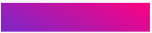
Here are some cool examples in the wild:
Vercel - cloud platform
But how is it done?
The magic lies in linear-gradient, -webkit-background-clip and -webkit-text-fill-color
Here's the quick code snippet for it 👇
h1{
  font-family: "Verdana", sans-serif;
  text-transform:uppercase;
  font-size:100px;
  background: linear-gradient(#7928CA, #FF0080);
  -webkit-background-clip: text;
  -webkit-text-fill-color: transparent;
}
This will make 👇

Gradient direction
So that's the general basics - what if you want to control the gradient direction? What if you want it to go from left to right rather than horizontally?
linear-gradient takes 2+ parameters:
- the direction
- the colors
So you can write something like this:
.example{
  background: linear-gradient(27deg, #7928CA, #FF0080);
}
To get something like this:
You can have multiple colors by just adding another color to the list:
.example{
  background: linear-gradient(27deg, #7928CA, #FF0080, #7928CA);
}
👆 will produce this 👇

You can just keep adding as many colors as you want.
.example{
  background: linear-gradient(27deg, #7928CA, #FF0080, #7928CA, #FF0080);
}

How do you make gradient text look less '90s web'?
While gradients are cool, they can easily make your design look like 90s web. How do you avoid this?
The trick is in the fonts you select.
Chunkier sans serif fonts tend to be visually better on the eye than your standard websafe sans serif. It can help make your design look modern and fresh with a nice visual splash.
Here are some examples.
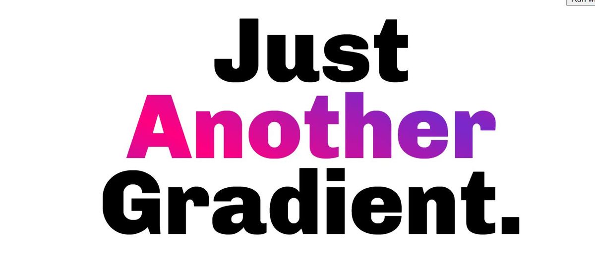
Montserrat
A classic modern font that has a clean look. Free from Google fonts.
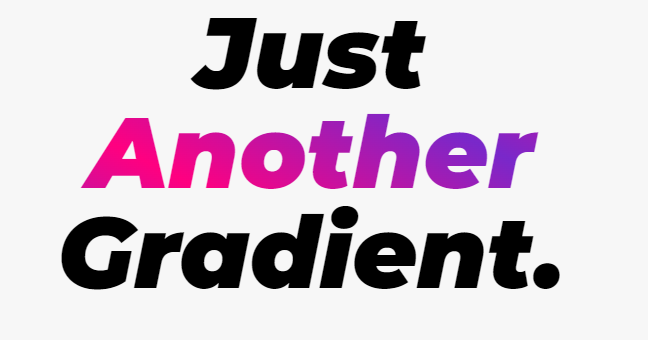
👇 HTML

  <h1>Just</h1>
  <h1 class="gradient">Another</h1>
  <h1 >Gradient.</h1>

👇CSS

@import url('https://fonts.googleapis.com/css2?family=Montserrat:ital,wght@1,900&display=swap');

h1{
  font-family: 'Montserrat', sans-serif;
  font-size:100px;
  line-height:100px;
  margin:0;
  text-align:center;
}

.gradient {
  background: linear-gradient(27deg, #7928CA, #FF0080, #7928CA, #FF0080);
  -webkit-background-clip: text;
  -webkit-text-fill-color: transparent;
}
Raleway
This font is another designer favorite. I've used the italics version. Free from Google Fonts.
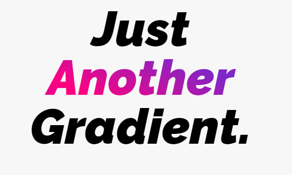
👇 HTML

  <h1>Just</h1>
  <h1 class="gradient">Another</h1>
  <h1 >Gradient.</h1>

👇 CSS

@import url('https://fonts.googleapis.com/css2?family=Raleway:ital,wght@1,900&display=swap');

h1{
  font-family: 'Raleway', sans-serif;
  font-size:100px;
  line-height:100px;
  margin:0;
  text-align:center;
}

.gradient {
   background: linear-gradient(27deg, #7928CA, #FF0080, #7928CA, #FF0080);
  -webkit-background-clip: text;
  -webkit-text-fill-color: transparent;
}
Work Sans
I quite like this one. It's thick. It's clean. It's modern. Free from Google Fonts.
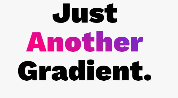
👇 HTML

  <h1>Just</h1>
  <h1 class="gradient">Another</h1>
  <h1 >Gradient.</h1>

👇 CSS
h1{
  font-family: 'Work Sans', sans-serif;
  font-size:100px;
  line-height:100px;
  margin:0;
  text-align:center;
}

.gradient {
   background: linear-gradient(27deg, #7928CA, #FF0080, #7928CA, #FF0080);
  -webkit-background-clip: text;
  -webkit-text-fill-color: transparent;
}
That's it.
The color you use also matters. Some color combinations work better than others, so you might need to play around with it to get it right.