As designers and developers, it’s easy to get caught up in the shiny and flashy aspects of building websites and applications. We pour over color palettes, search for the perfect imagery, and spend hours fine-tuning animations. But let’s not forget about the one element that ties everything together: typography.
Sure, we might spend a lot of time choosing the right font and adjusting our font sizes to get them just right. But how often do we really think about how our text is going to look on different screens? This is where fluid typography comes in.
What is Fluid Typography?
Fluid typography is a technique that allows text to scale and adjust automatically based on the dimensions of the user’s screen. This means that no matter how wide or narrow the screen is, your text is always going to look great.
Why We Need to Use Fluid Typography
How often do you come across a website where the text is either way too small or way too big to read comfortably?
It happens more often than you might think, and it’s a major usability issue. With fluid typography, we can ensure that our text is always legible and looks good no matter what device it’s being viewed on.
But it’s not just about usability. Fluid typography can also make our sites look more polished and professional. When the text scales and adjusts smoothly, it gives the impression that we’ve put a lot of thought and care into the design.

Enter clamp()
So, how do we implement fluid typography? One tool that can be really helpful is the clamp() function. clamp() allows you to set a minimum and maximum font size, and it ensures that the actual font size stays within that range.
Here’s an example of how it works:
.my-class {font-size: clamp(16px, 3vw, 22px);}
In this example, we’ve set the minimum font size to 16px, the maximum to 22px, and the actual font size to 3vw (3% of the viewport width). This means that the font size will scale up or down depending on the screen width, but it will never go below 16px or above 22px.
Why is clamp() so useful?
It gives us much more control over our font sizes. We can set specific minimum and maximum sizes to ensure that our text is always legible, no matter how small or large the screen is. Additionally, clamp() can help improve the performance of our sites because it prevents the font size from getting too out of control.
There are a few quirks to be aware of when using clamp(). One is that it’s not supported in all browsers, so you may need to use a polyfill to ensure that it works consistently across all platforms. Additionally, clamp() only adjusts font sizes, so it can’t be used to control other aspects of typography like line height or letter spacing.
Creating a Basic Automated Fluid Function
The first step is to choose the appropriate minimum and maximum font sizes.
These will vary depending on the specific needs of your project, but a good rule of thumb is to use a minimum font size of 16px and a maximum of 22px.
Next, we’ll use media queries to apply the function at different breakpoints. For example, we might set the font size to 18px at a screen width of 640px, and increase it to 22px at a width of 960px.
Here’s what that might look like:
@media (min-width: 640px) {
  .my-class {
    font-size: 18px;
  }
}

@media (min-width: 960px) {
  .my-class {
    font-size: 22px;
  }
}
We can then apply the clamp() function within each of these media queries to ensure that the font size stays within our specified range:
@media (min-width: 640px) {
  .my-class {
    font-size: clamp(16px, 18px, 22px);
  }
}

@media (min-width: 960px) {
  .my-class {
    font-size: clamp(16px, 22px, 22px);
  }
}
Explaining the Units
As you may have noticed, we used different units in the examples above. When it comes to fluid typography, there are several different units that we can use, including rem, em, and vw.
rem (root em) is a unit of measurement that is relative to the font size of the root element (usually the html element). This means that if we set the font size of the root element to 16px, 1rem would equal 16px.
em is similar to rem, but it is relative to the font size of the element it is applied to, rather than the root element. This can be useful if we want to create a hierarchy of font sizes within our design.
vw (viewport width) is a unit that is based on the width of the viewport. In the example above, we used 3vw as the actual font size in our clamp() function. This means that the font size will be 3% of the viewport width.
Each of these units has its own set of pros and cons, so it’s important to choose the one that is best suited to your needs. Rem and em can be a bit more predictable and easier to work with, but they don’t always scale as smoothly as vw.
vw can give us a more fluid and responsive design, but it can be a bit harder to work with because the font size is based on the viewport width, which can vary greatly from device to device.
Adding Default Breakpoints
While fluid typography is a great way to create text that scales and adjusts automatically, sometimes it can be helpful to add some additional breakpoints to fine-tune the design.
For example, we might want to set a specific font size at a certain screen width to ensure that the text looks just right.
To do this, we can use media queries just like we did when creating our basic automated fluid function. For example, we might set the font size to 18px at a screen width of 640px, and increase it to 22px at a width of 960px:
@media (min-width: 640px) {
  .my-class {
    font-size: 18px;
  }
}

@media (min-width: 960px) {
  .my-class {
    font-size: 22px;
  }
}
We can then apply the clamp() function within each of these media queries to ensure that the font size stays within our specified range:
@media (min-width: 640px) {
  .my-class {
    font-size: clamp(16px, 18px, 22px);
  }
}

@media (min-width: 960px) {
  .my-class {
    font-size: clamp(16px, 22px, 22px);
  }
}
This will give us a bit more control over the font sizes at specific breakpoints, while still allowing the text to scale fluidly between those breakpoints. It’s a good idea to add breakpoints at key points in the design, such as at the minimum and maximum widths of common devices. This will help ensure that the text looks good no matter what screen it’s being viewed on.
Wrap Up
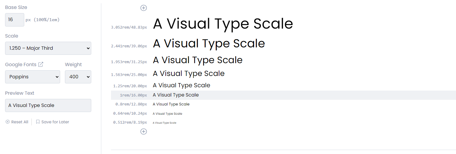
Fluid typography is an important but often overlooked aspect of web design. By using techniques like clamp() and media queries, we can create text that scales and adjusts automatically, ensuring that it is always legible and looks great on any device. By adding default breakpoints and using tools like modular scales and the golden ratio, we can fine-tune the design and create fluid typography that feels cohesive and balanced.
So next time you’re working on a project, don’t forget to give some thought to your typography. It might not be the flashiest element on the page, but it’s an essential part of any good design.
Thank you for reading 😁