

Have you ever wondered how those fancy expanding search boxes or forms are done? While it looks cool and feels like it could be complicated to code, it turns out to be quite simple.
All you need is a few lines of HTML, a good dash of CSS, and two JavaScript functions.
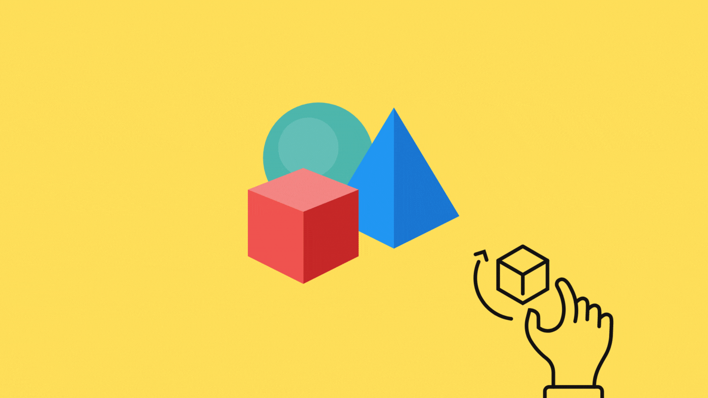
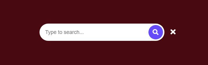
Here is what we will be making:

Let’s start with the HTML. When you really look at it, there isn’t much to the search form — just a search input and some buttons. For our search form, we will be using the free version of font awesome, which you can import via CDN.
Here is the CDN link I used for this specific tutorial that you can copy and paste over to your HTML page.
<link rel="stylesheet" href="https://cdnjs.cloudflare.com/ajax/libs/font-awesome/5.15.3/css/all.min.css" />Here is the HTML for the various parts of the search box. There is a container class called search-box which will keep everything together and allow you to put the search box wherever you want on your page. There is also a search-btn icon that we’re going to use as our search button, and a cancel-btn icon to close everything when not needed.
We’re not using actual <button> here because if you’re using a front-end framework like Angular, React, or Vue, you can easily handle that in your JavaScript — which is a different story and tutorial.
<div class="search-box">
<input type="text" placeholder="Type to search..."/>
<div class="search-btn">
<i class="fas fa-search"></i>
</div>
<div class="cancel-btn">
<i class="fas fa-times"></i>
</div>
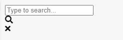
</div>That’s basically it for the HTML. Here is what our search form looks like without any styling.
Let’s get on to styling it with some CSS.
This part is not compulsory because it’s just setting the page background color and centering everything. It’s mostly for visual purposes if you’re just following along.
html,body{
  display:grid;
  height:100%;
  place-items: center;
  background: #490910;
}
Let’s start with our search input. What’s going to happen is that when we click on our search icon, the JavaScript will attach a class called active to our search-box so we can set the width and trigger the transition animation. We also want our input to show when it’s in its active state. The transition is set to cubic-beizer to give it that snappy feel.
Then we have the base of what the input looks like, configured through the width, height, border, background, font-size, padding, and border-radius. The opacity is set to 0 because we are assuming that it is inactive until the active class is there.
.search-box{
  position:relative;
  height:60px;
  width:0px;
  transition: all 0.5s cubic-bezier(0.68, -0.55, 0.265, 1.55 );
}

.search-box.active{
  width: 350px;
}

.search-box.active input{
  opacity:1;
}

.search-box input{
  height:100%;
  width:100%;
  border:none;
  background:#fff;
  font-size:18px;
  border-radius: 50px;
  padding: 0 60px 0 20px;
  outline:none;
  opacity:0;
  transition: all 0.5s cubic-bezier(0.68, -0.55, 0.265, 1.55 );
}
Here is what it looks like when active is present:
Now it’s time to start styling our search button. To do this, we are going to target the search-btn selector. Here, we set the height and width , along with other styling things like color , border-radius to give it that nice circle border, and change our cursor to a pointer so the user knows to click on it.
We also move it around and put it at the end of our input through position:absolute . This is possible because we’ve already set position:relative at .search-box . Our coordinates are based on the parent boundaries of .search-box.
Since we also want to make sure that our search button is clickable all the time, we adjust our z-index to 2 so it sits on top of everything.
We also configure the search button color based on different states — that is, if the search form has been toggled or not. This is done through our active class selector again. So when active is present, change the background and color of the search icon. We can do this because the icon is actually a font, which means that we can change the color of it to whatever we want.
.search-box .search-btn{
height:50px;
width:50px;
background: #fff;
color:#664AFF;
position: absolute;
top:50%;
right:-75px;
transform: translateY(-50%);
line-height:50px;
text-align:center;
border-radius:50%;
font-size:20px;
cursor:pointer;
transition: all 0.5s cubic-bezier(0.68, -0.55, 0.265, 1.55 );
z-index:2;
}
.search-box.active .search-btn{
height:50px;
width:50px;
background: #664AFF;
color:#fff;
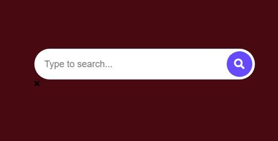
}Here is what it looks like so far with active applied:
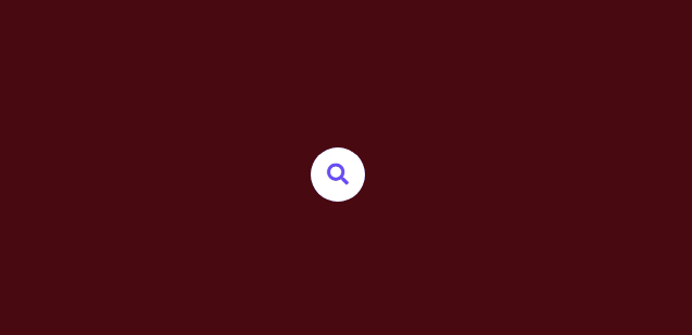
Without active:

Let’s style our cancel button for the final visual touches. The same ideas that were used for the search-btn is applied here, with a few minor changes like color . Take note that when active is not applied, the opacity is set to 0 . This is because we don’t need it when it’s just the search button. The cancel button only appears if the search box has active.
.search-box .cancel-btn{
position: absolute;
color: #664AFF;
top:50%;
right: -75px;
transform: translateY(-50%);
color:#664AF;
font-size:25px;
cursor:pointer;
height:50px;
width:50px;
line-height:50px;
text-align:center;
border-radius:50%
opacity:0;
}
.search-box.active .cancel-btn{
right: -135px;
opacity:1;
color:#fff;
transition: all 0.5s cubic-bezier(0.68, -0.55, 0.265, 1.55 );
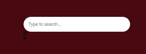
}Here’s what it looks like with active:
Here’s what it looks like without active:

Now that we’ve got the basics of what our search form looks like, it’s time to add JavaScript.
There are three elements we need to target — the search button, the cancel button, and the search box. When we click on our search button, we want to add a class called active to our search box. When we click cancel, we want to remove active from our search box.
To do this, we use document.querySelector to target the individual parts through their classes. Then we use onclick to activate the attachment of active based on context. Here is the JavaScript for it:
const searchBtn = document.querySelector(".search-btn");
const cancelBtn = document.querySelector(".cancel-btn");
const searchBox = document.querySelector(".search-box");

searchBtn.onclick = () => {
  searchBox.classList.add("active");
}

cancelBtn.onclick = () => {
  searchBox.classList.remove("active");
}
And that’s basically it folks. Now when you click, active is added or removed based on which button you clicked. If you’re working with frameworks like Angular, React, or Vue, this step is most likely unnecessary because you can use your own techniques to achieve the same JavaScript attachment of active effect. What you only need is the HTML and the CSS.
Here is all the code in one space.
The CDN:
<link rel="stylesheet" href="https://cdnjs.cloudflare.com/ajax/libs/font-awesome/5.15.3/css/all.min.css" />The HTML:
<div class="search-box">
    <input type="text" placeholder="Type to search..."/>
    <div class="search-btn">
      <i class="fas fa-search"></i>
    </div>

    <div class="cancel-btn">
      <i class="fas fa-times"></i>
    </div>
  </div>
The CSS:
html,body{
  display:grid;
  height:100%;
  place-items: center;
  background: #490910;
}

.search-box{
  position:relative;
  height:60px;
  width:0px;
  transition: all 0.5s cubic-bezier(0.68, -0.55, 0.265, 1.55 );
}

.search-box.active{
  width: 350px;
}

.search-box.active input{
  opacity:1;
}

.search-box input{
  height:100%;
  width:100%;
  border:none;
  background:#fff;
  font-size:18px;
  border-radius: 50px;
  padding: 0 60px 0 20px;
  outline:none;
  opacity:0;
  transition: all 0.5s cubic-bezier(0.68, -0.55, 0.265, 1.55 );
}

.search-box .search-btn{
  height:50px;
  width:50px;
  background: #fff;
  color:#664AFF;
  position: absolute;
  top:50%;
  right:-75px;
  transform: translateY(-50%);
  line-height:50px;
  text-align:center;
  border-radius:50%;
  font-size:20px;
  cursor:pointer;
  transition: all 0.5s cubic-bezier(0.68, -0.55, 0.265, 1.55 );
  z-index:2;
}

.search-box.active .search-btn{
  height:50px;
  width:50px;
  background: #664AFF;
  color:#fff;
}

.search-box .cancel-btn{
  position: absolute;
  color: #664AFF;
  top:50%;
  right: -75px;
  transform: translateY(-50%);
  color:#664AF;
  font-size:25px;
  cursor:pointer;
  height:50px;
  width:50px;
  line-height:50px;
  text-align:center;
  border-radius:50%
  opacity:0;
}

.search-box.active .cancel-btn{
  right: -135px;
  opacity:1;
  color:#fff;
    transition: all 0.5s cubic-bezier(0.68, -0.55, 0.265, 1.55 );
}
The JavaScript:
const searchBtn = document.querySelector(".search-btn");
const cancelBtn = document.querySelector(".cancel-btn");
const searchBox = document.querySelector(".search-box");

searchBtn.onclick = () => {
  searchBox.classList.add("active");
}

cancelBtn.onclick = () => {
  searchBox.classList.remove("active");
}