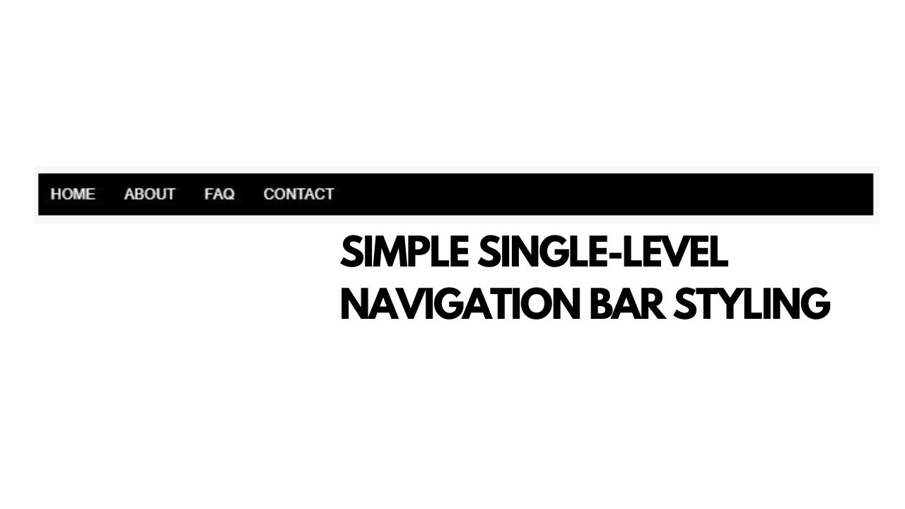
Simple Menu Navigation Bar Styling

For CSS newbies, a navigation bar is something that you’ll encounter sooner or later. This is the first post for a series of back-to-basics code tutorials I’m doing in conjunction with my YouTube channel reboot.
I’m a writer by strength but I also want to get better at explaining things verbally too. This is the write-up part for the video below. Don’t forget to like and subscribe 😉
Most navigation bars you’ll encounter comes in the form of a list. However, lists by default designs are generally ugly. In this tutorial, we are going to turn the unordered list item into a simple and visually pleasing horizontal navigation bar.
First, let’s start off with our unordered list:
<ul>
    <li><a href="#">Home</a></li>
    <li><a href="#">About</a></li>
    <li><a href="#">FAQ</a></li>
    <li><a href="#">Contact</a></li>
</ul>
This is what it currently looks like:

In short, it’s pretty basic and very 1980s Internet. So how do we get from the above to the screenshot below?

First, start by putting outlines on all your elements so you know exactly what your CSS is targeting.
ul{border:solid 1px black;}
li{border:solid 1px green;}
a{border:solid 1px red;}
Now your navigation menu bar looks something like this:

Yes. It’s still ugly. But we’re getting there.
The next step is to turn your li elements from its default block scope to an inline-block scope. block scopes make the element take up the entire width of the page. We want each of the li elements to line up next to each other, that is why we use inline-block .
Here’s the new CSS:
ul{
    border:solid 1px black;
}

li{
    border:solid 1px green;
    display:inline-block;
}

a{
    border:solid 1px red;
}
Here is what it looks like:

Yes. I know. It’s still ugly but at least everything is sort of in the right position now. The next step is to get rid of the spacing in front of Home . This spacing is caused by the default padding settings that all lists have. To get rid of the padding, we can do this by setting padding to 0 at ul .
Here is what the CSS looks like now:
ul{
    border:solid 1px black;
    padding:0;
}

li{
    border:solid 1px green;
    display:inline-block;
}

a{
    border:solid 1px red;
}
Here is what your menu navigation bar looks like:

The menu navigation bar looks a bit too thin. Let’s make it a bit bigger. To do this, we can put the padding on the li . However, our clickable area remains small and can be a bit annoying for the user.
If we put padding on li , the clickable area will only be whatever is in the red border areas.

However, if we move the padding to the a selector, we get something like this:

This creates an issue because your container element (that is, your ul) doesn’t expand to accommodate the padding. This is because a is set to inline by default — which means that padding and margins don’t affect the surrounding area, no matter how badly you want it to.
For example, here is a paragraph with an inline a that has some padding on it. The padding only impacts the sides but creates an overlap on the text for the top and bottom settings.

To fix our overlapping issue for our navigation menu bar, we can override the default to display:block .
Here is the new CSS:
ul{
    border:solid 1px black;
    padding:0;
}

li{
    border:solid 1px green;
    display:inline-block;
}

a{
    border:solid 1px red;
    display:block;
    padding:10px;
}
Here is what your menu navigation bar looks like with display:block applied on the a selector.

Now that we’ve got the pieces in the right place, it’s time to make it look pretty.
First, let’s remove all the borders and put a nice black background on the menu navigation bar.
ul{
    padding:0;
    background:black;
}

li{
    display:inline-block;
}

a{
    display:block;
    padding:10px;
}
Here’s what it looks like:

The color scheme looks a bit trippy so let's change it to something that has better contrast and remove the underlining on the links.
ul{
    padding:0;
    background:black;
}

li{
    display:inline-block;
}

a{
    display:block;
    padding:10px;
    color:white;
    text-decoration:none;
}
Here’s what it looks like now:

It looks a little bit better but the font can do with an update. Currently, it’s a serif font. Let’s change it to a sans serif. We can do this at the ul level so it covers everything inside our menu navigation bar. You can, technically, do it at the a but if you have nesting in the future, it may not get applied correctly.
Here’s the CSS:
ul{
    padding:0;
    background:black;
    font-family:Arial, sans serif;
}

li{
    display:inline-block;
}

a{
    display:block;
    padding:10px;
    color:white;
    text-decoration:none;
}
Arial is your selected font, with sans serif as you backup default if Arial isn’t available on your user’s device.

Let’s make the font-size a little bit smaller and capitalize everything so it looks a bit more professional.
ul{
    padding:0;
    background:black;
    font-family:Arial, sans serif;
    font-size:12px;
    text-transform:uppercase;
}

li{
    display:inline-block;
}

a{
    display:block;
    padding:10px;
    color:white;
    text-decoration:none;
}
And here’s the final result:

That’s basically it.
For now, thank you for reading (and watching).


Comments ()