How To Create An Animated Email Subscription Form With Pure CSS
Forms are ugly by default. Creating a basic form is not hard — but a lot of tutorials I remember encountering in my early days of coding required some sort of JavaScript.
CSS, however, is a lot more powerful than you think.
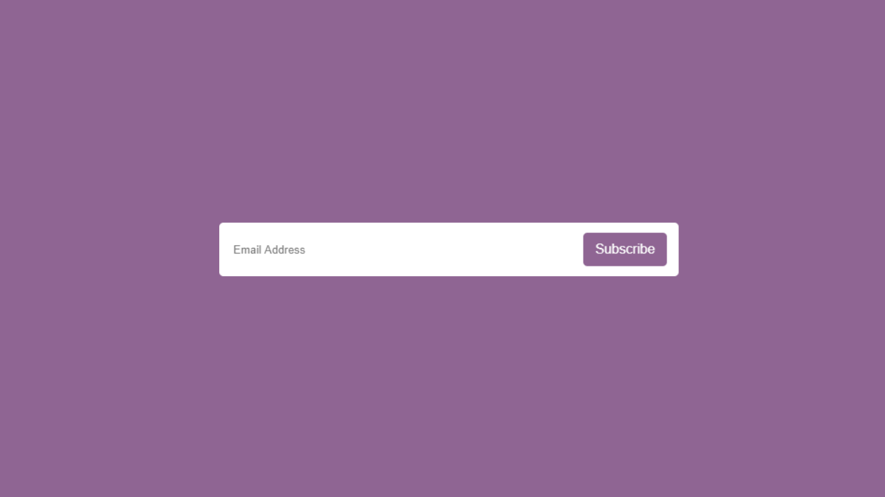
Here is what we will be making:
Here is the HTML to kickstart us off:
<div class="wrapper">
    <input type="checkbox" id="click">
    <label for="click" class="btn-1">Subscribe</label>
    <div class="field">
      <input type="text" placeholder="Email Address">
      <label for="click" class="btn-2">Subscribe</label>
    </div>
</div>
This is basically a simple form with some labels and a checkbox so we know which visual state we’re in. It will let us leverage pseudo-states in CSS without needing to do any programmatic selection. There is no actual button here. In part, it’s because I’m assuming that you’ll be using Angular, React, Vue, or some sort of frontend framework to handle what happens with the click event.
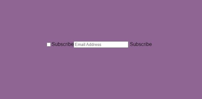
Here is what the subscribe form looks like without CSS:

Yup. It’s pretty darn ugly. Let’s get on with styling it in CSS.
The CSS inside html and body can be abstracted out into its own container. However, I’m just putting it here because there is no other element on the page. What’s happening here is that a grid is created and all the items have been centered on the page. The font-family can be whatever you want it to be, along with the background.
The .wrapper selector repositions the subscribe form to the center of the page via position:relative , in addition to setting the height and width. display:flex turns elements inside into flex items and aligns the items inside to be centered against the .wrapper container.
html,body{
  display:grid;
  height:100%;
  place-items:center;
  background: #8F6593;
  font-family:'Arial', sans serif;
}
.wrapper{
  position:relative;
  height: 60px;
  width: 400px;
  display:flex;
  align-items:center;
  justify-content:center;
  text-align:center;
}
Here is what it looks like:
Now that we’ve got everything into position, it’s time to style it. Let’s start with the first Subscribe label. This one has the class btn-1 attached to it.
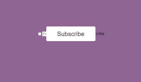
We are going to make it the full height of the subscribe container, with a white background, and text color that matches the background (#3B252C ). There are a few other font related configurations in the CSS, such as font-weight , font-size , and line-height. Because we also want this to look like a button, we are going to round the corners with border-radius: 5px. The cursor is changed to a pointer so the user knows to click on it.
We are also adding a transition to this button, so when the user clicks it, there is a smooth ease-in-out flow animation effect.
.wrapper .btn-1{
  position: absolute;
  height: 100%;
  width: 50%;
  background:white;
  color:#3B252C;
  font-weight: 500;
  font-size:25px;
  line-height: 60px;
  border-radius: 5px;
  cursor:pointer;
  transition: all 0.4s ease-in-out;
}
This is what the subscription form looks like with the above CSS applied:
The next thing we want to do is hide this button when it gets clicked. This is so it makes room for the actual subscription form we want to show. To do this, we use the ~ sign to indicate and target the sibling selector .btn-1 . So what the selector below is saying is — if the state of #click is checked , apply the following CSS to .btn-1 . We hide .btn-1 by reducing the opacity, and decrease its size via height and width to give the shrinking animation that’s achieved through the transition set at the actual .btn-1 selector.
#click:checked ~ .btn-1 {
  height: 40px;
  width: 100px;
  opacity: 0;
  pointer-events: none;
}
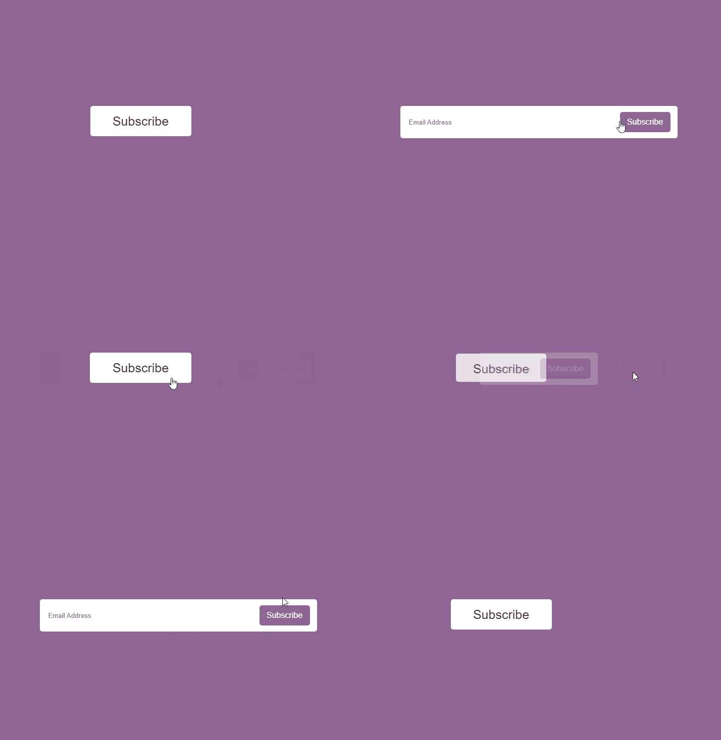
Here is what the subscribe button looks like in action:
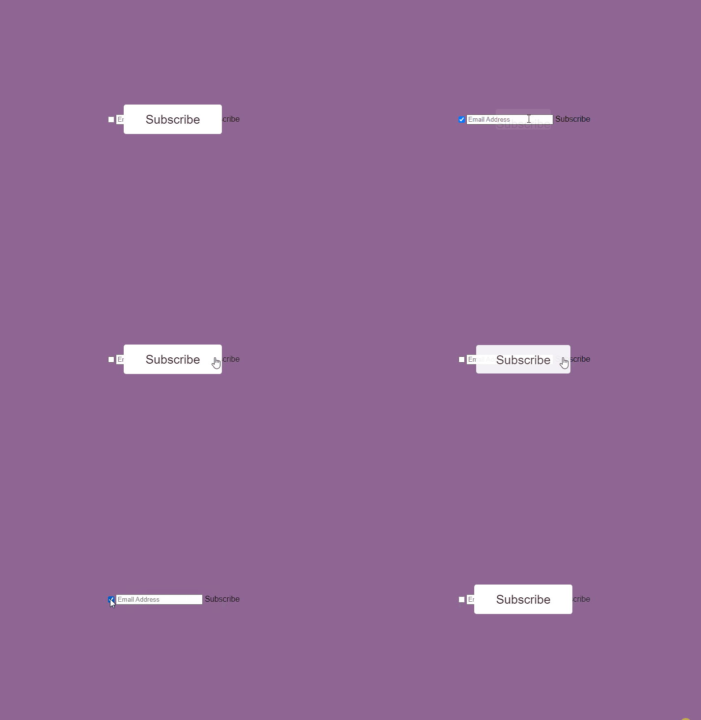
Although .btn-1 looks like an actual button, it’s actually a label in reality. We’re just clicking on the label to toggle the checkbox, and therefore hide and show our .btn-1 .
Now it’s time to style our email field. There are three things happening in the CSS below for our subscribe form. The .wrapper .field selector is dealing with the container that holds our actual form. It’s setting the width to 0 so that we can create the expanding animation when #click is checked. The opacity is also set to 0 so that we don’t see it until #click is checked .
.wrapper .field input is the actual styling for the field itself and has nice rounded corners through the border-radius. There are a few other visual things like padding and outline .
Like .btn-1, .field is targeted via the sibling sector when #click:checked happens. The opacity is increased to 1 and the width becomes 100% to fill the length of the container.
.wrapper .field{
  height: 100%;
  width: 0%;
  opacity:0;
  transition: 0.4s ease-in-out;
}
.wrapper .field input{
  height:100%;
  width:100%;
  border:2px solid #fff;
  border-radius:5px;
  padding: 0 130px 0 15px;
  outline:none;
}
#click:checked ~ .field{
  opacity:1;
  pointer-events: auto;
  width:100%;
}
Here’s what our subscribe form looks like now:
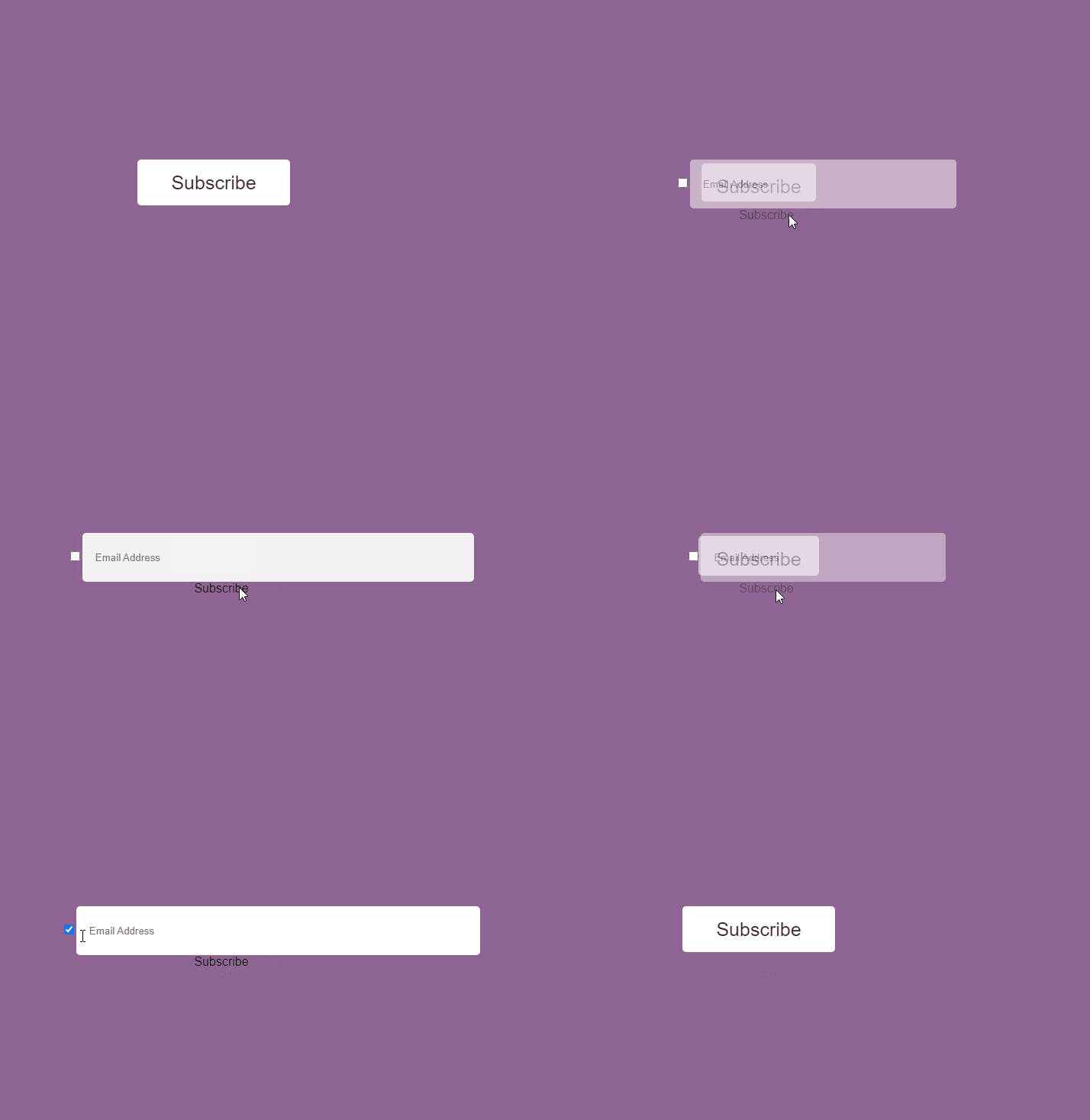
The final step is to style the second Subscribe button and hide the checkbox. This is easily achieved with the CSS below.
.wrapper .field .btn-2{
  cursor:pointer;
  position: absolute;
  right: -135px;
  top:50%;
  transform: translateY(-45%);
  height:40px;
  width: 100px;
  background: #8F6593;
  color:white;
  border-radius: 5px;
  line-height: 40px;
  transition: 0.4s ease-in-out;
}
.wrapper #click{
  display:none;
}
And that is basically it! Here is the final result.

Here is the full HTML and CSS for our subscribe form.
<div class="wrapper">
    <input type="checkbox" id="click">
    <label for="click" class="btn-1">Subscribe</label>
    <div class="field">
      <input type="text" placeholder="Email Address">
      <label for="click" class="btn-2">Subscribe</label>
    </div>
</div>
And the CSS:
html,body{
  display:grid;
  height:100%;
  place-items:center;
  background: #8F6593;
  font-family:'Arial', sans serif;
}
.wrapper{
  position:relative;
  height: 60px;
  width: 400px;
  display:flex;
  align-items:center;
  justify-content:center;
  text-align:center;
}
.wrapper .btn-1{
  position: absolute;
  height: 100%;
  width: 50%;
  background:white;
  color:#3B252C;
  font-weight: 500;
  font-size:25px;
  line-height: 60px;
  border-radius: 5px;
  cursor:pointer;
  transition: 0.4s ease-in-out;
}
#click:checked ~ .btn-1 {
  height: 40px;
  width: 100px;
  opacity: 0;
  pointer-events: none;
}
.wrapper .field{
  height: 100%;
  width: 0%;
  opacity:0;
  pointer-events:none;
transition: 0.4s ease-in-out;
}
.wrapper .field input{
  height:100%;
  width:100%;
  border:2px solid #fff;
  border-radius:5px;
  padding: 0 130px 0 15px;
  outline:none;
}
#click:checked ~ .field{
  opacity:1;
  pointer-events: auto;
  width:100%;
}
.wrapper .field .btn-2{
  cursor:pointer;
  position: absolute;
  right: -135px;
  top:50%;
  transform: translateY(-45%);
  height:40px;
  width: 100px;
  background: #8F6593;
  color:white;
  border-radius: 5px;
  line-height: 40px;
  transition: 0.4s ease-in-out;
}
.wrapper #click{
  display:none;
}
Comments ()