Creating 3D Pure CSS Hover Flip Card Effect

When it comes to front-end, your aesthetics implementation skills are limited by how well you can make CSS do whatever you want it to do. A pure CSS hover flip card effect is something that we often see in portfolio sites and splash pages. They can also be modified to fit funky designs such as cart items, product displays, and pricing tables.
These, of course, are just ideas.
This is what we are going to be making:

Here’s how the process works:
- user hovers over the card
- card flips over to show the backside
Based on the above-expected effect, we know that there is going to be a front and backside. We will also have a container <div> with a class=card to keep it all together. The image is from Unsplash but you can also use your own one. We also have a middle class to center everything on our page.
I also used font-awesome for the icons. You can add this in the <head> section of your HTML. Here is a quick snippet of font-awesome CDN:
<link rel="stylesheet" href="https://cdnjs.cloudflare.com/ajax/libs/font-awesome/5.15.3/css/all.min.css">Here it is in the rest of the HTML:
<div class="card">

   <div class="front">
     <img src="https://images.unsplash.com/photo-1601758174493-45d0a4d3e407">
   </div>

   <div class="back middle">
     <div class="back-content middle">
       <h2>Aphinya Dechalert</h2>

       <span>30 Days Of Code challenge</span>

       <div class="sm">
         <a href="#"><i class="fab fa-twitter"></i></a>
         <a href="#"><i class="fab fa-facebook"></i></a>
         <a href="#"><i class="fab fa-youtube"></i></a>
         <a href="#"><i class="fab fa-medium"></i></a>
       </div>
     </div>
   </div>
  </div>
And that’s basically it for the HTML. You can get creative in your own version and add things like add-to-cart buttons if you’re going to mod this tutorial for an eCommerce website.
Right now, the image will appear too large and everything will just look wrong. However, this is all we need. It’s the CSS that does a lot of visual heavy-lifting from here.
Now for the CSS.
This part is not compulsory but if you’re starting off with barebones blank HTML and CSS, it’s good to do a little visual reset just to make everything look a bit nicer.
*{
  margin: 0;
  padding: 0;
  text-dectoration:none;
  font-family: "Arial", sans serif;
}
body{
  background: #333;
}
This next .middle selector, which is used to center everything on the page. This selector isn’t compulsory for the flip effect but just exists for visual and aesthetics reasons for this tutorial.
.middle{
  position: absolute;
  top:50%;
  left:50%;
  transform: translate(-50%, -50%);
}
Now we are going to set up our card container. This includes turning our cursor to a pointer to give the user an added extra effect, in addition to the card’s width and height.
.card{
  cursor: pointer;
  width: 340px;
  height:480px;
}
Now it’s time to configure our front and back selectors. We want our front and back cards to be the size that we set on the container. To do this, we set the width and height to 100% .
.front, .back{
  width:100%;
  height: 100%;
}
Currently, the front of our card contains an image that is too big. We want our CSS to be able to handle it and make it fit the size of our configured box in a proportionate manner.
To do this, we can set the height to 100% . The width will be automatically calculated.
.card img{
  height:100%;
}
Now your card should look something like this:
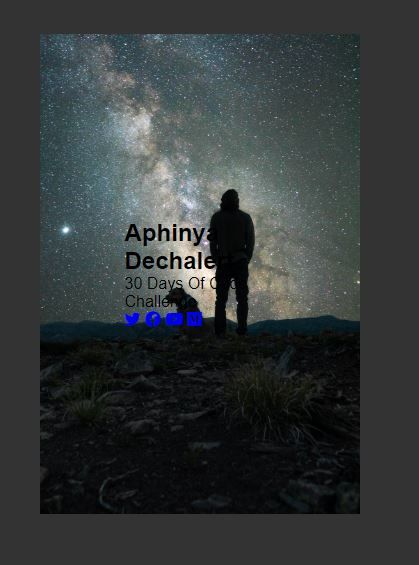
We also want to absolutely position the cards on top of one another so that it creates the two sides needed to enact the flip effect. In addition to this, we are going to set the overflow to hidden to prevent any internal scroll that may occur.
Here is our new .front and .back CSS.
.front, .back{
  width:100%;
  height: 100%;
  overflow:hidden;
  position:absolute;
}
Now it’s time to start styling the backside of our flip hovercard. First, we are going to add the background color for the card. Let’s make this white so it contrasts with our background. You can use whatever color you want.
.back {
   background: white;
}
Your card should look something like this:
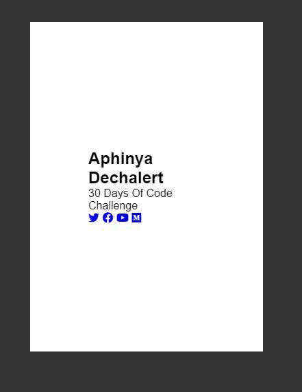
This doesn’t look that great. We are style this a little to make it look presentable. This part is not compulsory to make the flip card effect but more a prettifying step.
.back-content{
  color: #2c3e50;
  text-align:center;
  width:100%;
}
Here’s what it looks like with the above CSS applied:
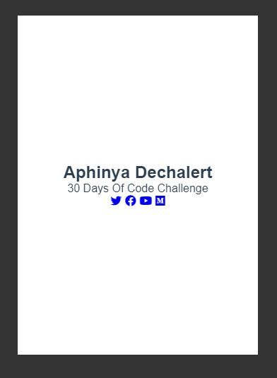
Let’s style the icons a little to make them look nicer. We are going to be using display:inline-flex to create an automated grid system. Each icon is going to be 40px by 40px. It’s going to sit in the middle of the flexbox and is going to have the same nice grey shade as the background. There is also a border-radius of 50% on it to create a circle. This circle is going to show when our mouse hovers over it. This is achieved by inverting the colors on a:hover .
Here’s the CSS:
.sm{
  margin:20px;
}
.sm a{
  display:inline-flex;
  width:40px;
  height:40px;
  text-decoration:none;
  justify-content:center;
  align-items: center;
  color: #2c3e50;
  font-size:24px;
  transition:0.4s;
  border-radius:50%;
}
.sm a:hover{
  background: #2c3e50;
  color:white;
}
Here’s what it looks like with the above CSS applied:
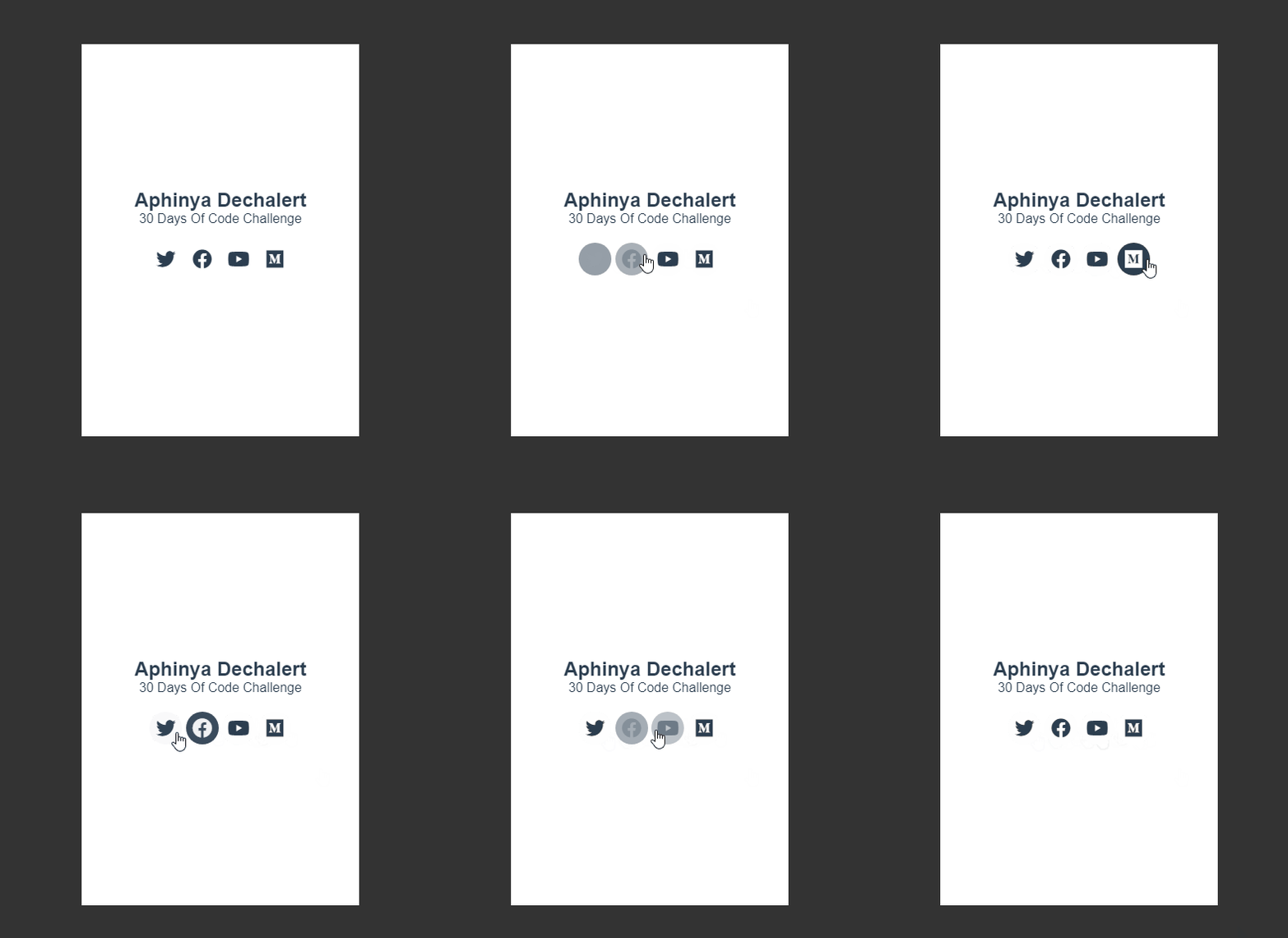
Now it’s time to create the flip hover effect. This is done through transform. CSS transform lets you do a number of things to a particular element. It can rotate, scale, skew and translate your element based on a series of degrees and coordinates.
For the hover flip effect, we are going to target rotateY() .
If you imagine your CSS in a 3D space, it can look a bit like this:
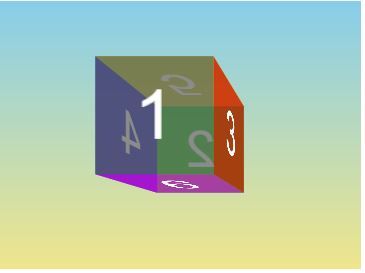
We want our card to turn so that side 2 is facing us. To do this, we use rotateY() to rotate it on the Y-axis by 180deg .
So here is now new .back CSS:
.back{
  background:#fff;
  transform:rotateY(180deg);
}
Here is what it looks like:
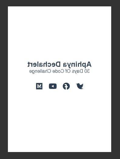
Now we want to hide this back part until there is a mouse hovering over our card. To do this, we use backface-visibility at .front and .back. This means that no matter which side is showing, it’s not going to try and also show the other side as well.
Here is what our new CSS looks like:
.front, .back{
  width:100%;
  height: 100%;
  overflow:hidden;
  backface-visibility: hidden;
  position:absolute;
}
Now, when we hover our card, we want it to flip to the other side:
.card:hover > .back{
  transform: perspective(600px) rotateY(0deg);
}
We also added a perspective() to the transform in order to make your card appear protruding when it flips over. The number we use inside perspective() will determine how far ‘back’ the perspective goes. This is called the vanishing point.
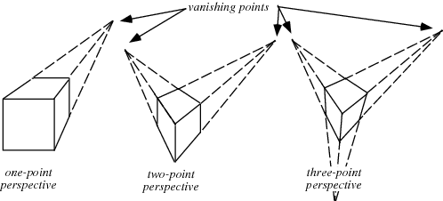
In CSS, perspective() only takes one value and works on a single vanishing point.
You can’t quite see it yet but the effect will show itself once you add a transition to your front and back selectors to show when the :hover is triggered.
Here’s what the effect looks like with the above CSS applied:

Currently, it just looks like a normal hover effect. We are going to add a transition on the .back and .front selectors to visually slow down what’s happening behind the scenes.
Here is the new CSS for .back and .front.
.front, .back{
  width:100%;
  height: 100%;
  overflow:hidden;
  backface-visibility:hidden;
  position:absolute;
  transition: transform .5s linear;
}
Here’s what it looks like:

Now, we have a slight issue, only the back appears to be flipping. We also want the front to rotate away.
To do this, we set the hover effect and transform on front too.
.card:hover > .back{
  transform: perspective(600px) rotateY(0deg);
}
And there we have it, our flip hover effect.

Here is the HTML and CSS for the hover flip card effect:
<!DOCTYPE html>
<html>
<head>
  <meta charset="utf-8">
  <meta name="viewport" content="width=device-width">
  <title>30 Days Of Code</title>

  <link rel="stylesheet" href="https://cdnjs.cloudflare.com/ajax/libs/font-awesome/5.15.3/css/all.min.css">
</head>
<body>

 <div class="card middle">

   <div class="front">
     <img src="https://images.unsplash.com/photo-1601758174493-45d0a4d3e407">
   </div>

   <div class="back">
     <div class="back-content middle">
       <h2>Aphinya Dechalert</h2>

       <span>30 Days Of Code Challenge</span>

       <div class="sm">
         <a href="#"><i class="fab fa-twitter"></i></a>
         <a href="#"><i class="fab fa-facebook"></i></a>
         <a href="#"><i class="fab fa-youtube"></i></a>
         <a href="#"><i class="fab fa-medium"></i></a>
       </div>
     </div>
   </div>
  </div>
</body>
</html>
And the CSS:
*{
  margin: 0;
  padding: 0;
  text-dectoration:none;
  font-family: "Arial", sans serif;
}
body{
  background: #333;
}
.middle{
  position: absolute;
  top:50%;
  left:50%;
  transform: translate(-50%, -50%);
}
.card{
  cursor: pointer;
  width: 340px;
  height:480px;
}
.card img{
  height:100%;
}
.front, .back{
  width:100%;
  height: 100%;
  overflow:hidden;
  backface-visibility:hidden;
  position:absolute;
  transition: transform .5s linear;
}
.card:hover > .front{
  transform: perspective(600px) rotateY(-180deg);
}
.card:hover > .back{
  transform: perspective(600px) rotateY(0deg);
}

.back{
  background:#fff;
  transform:rotateY(180deg);
}
.back-content{
  color: #2c3e50;
  text-align:center;
  width:100%;
}
.sm{
  margin:20px;
}
.sm a{
  display:inline-flex;
  width:40px;
  height:40px;
  text-decoration:none;
  justify-content:center;
  align-items: center;
  color: #2c3e50;
  font-size:24px;
  transition:0.4s;
  border-radius:50%;
}
.sm a:hover{
  background: #2c3e50;
  color:white;
}
Barebones HTML and CSS for Hover Flip Card Effect
Here is the barebones code without any decoration or additional styling.
<div class="card">
   <div class="front">
     <p>front side</p>
   </div>

   <div class="back">
     <p>back side</p>
   </div>
</div>
Here is the CSS:
.card{
  cursor: pointer;
  width: 340px;
  height:480px;
}
.front, .back{
  width:340px;
  height: 480px;
  overflow:hidden;
  backface-visibility:hidden;
  position:absolute;
  transition: transform .5s linear;
}
.card:hover > .front{
  transform: perspective(600px) rotateY(-180deg);
}
.card:hover > .back{
  transform: perspective(600px) rotateY(0deg);
}
.back{
  background:purple;
  transform:rotateY(180deg);
}
.front{
  background: green;
}
Here is what the barebones look like:
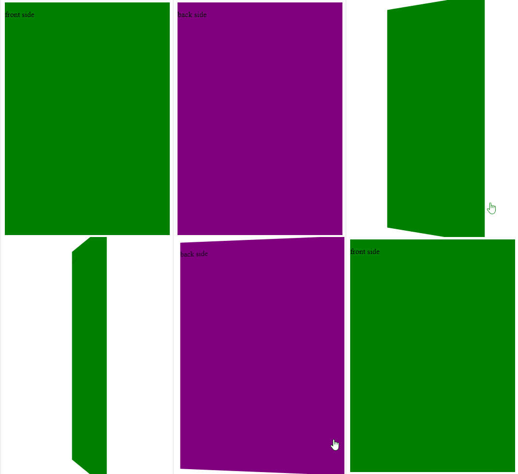
And that’s basically it for a flip hover card effect with pure CSS. I hope you found it useful.


Comments ()