
Range sliders — they look fancy and cool, but how exactly is it done? It turns out, with a good splash of CSS and a few lines of JavaScript is enough to do the trick.
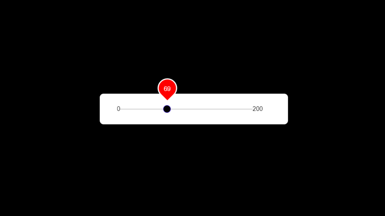
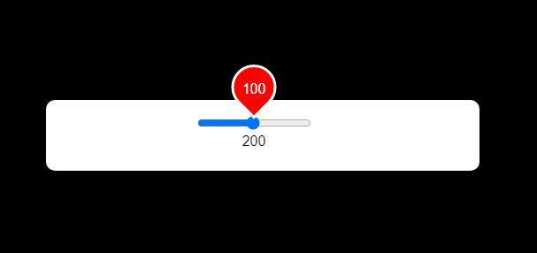
This is what we will be making:
Let’s start with the HTML.
<div class="range">
      <div class="sliderValue">
        <span>100</span>
      </div>
      <div class="field">
        <div class="value left">0</div>
        <input type="range" min="0" max="200" value="100" steps="1">
        <div class="value right">200</div>
      </div>
    </div>
The range class acts as a container to keep everything together. If we break down the range slider, there are three parts to it:
- the slider value, which is the number that is going to appear and change when we drag the slider across. This is contained inside
sliderValuebecause we want to turn the shape into a teardrop. - the range slider, which is contained inside the class
field - and the numbers on either side of the range slider
Here is what it looks like with no styling:
Let’s start the prettification process by centering our range slider, setting up the font-family and background. This part of the CSS is not compulsory but it’s good to have if you’re following along.
*{
  margin:0;
  padding:0;
  font-family: 'Arial', sans-serif;
}
html, body{
  display:grid;
  height:100%;
  text-align:center;
  place-items:center;
  background:black;
}
Next, let’s add a background to our .range selector so we can see what’s going on. Here, we can also set the dimensions via height and width, give it a bit of space with padding, and round it off with a bit of border-radius .
.range{
height: 80px;
width: 380px;
background:#fff;
border-radius: 10px;
padding: 0 65px 0 45px;
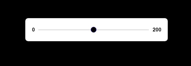
}Here is what the range slider looks like with the CSS applied:
Now that we’ve got the basic gist of the range slider done, let’s start styling our little teardrop popup that will move up and down in range when the slider moves. First, we are going to remove our .sliderValue from the normal flow through position:relative so our actual teardrop number thing can move around.
.range .sliderValue{
  position:relative;
  width:100%;
}
To make the teardrop, we are going to target the span that holds our value. Here, we set our position to absolute so we can slide it around through JavaScript later on. By default, we have a square boundary. To create our teardrop shape, we can flip this by 45deg so it looks like a diamond and border-radius all the edges except the tip that’s currently pointing towards the bottom. There are a few other decorative elements such as the teardrop’s background color, border, and general size.
.range .sliderValue span{
  position: absolute;
  height:45px;
  width:380px;
  color: white;
  font-weight: 500;
  top: -40px;
  transform: translateX(-50%) scale(1);
  transform-origin: bottom;
  transition: transform 0.3s ease-in-out;
  line-height: 55px;
  z-index: 2;
}
.range .sliderValue span:after{
  position: absolute;
  content: "";
  height:45px;
  width:45px;
  background: red;
  left:50%;
  transform: translateX(-50%) rotate(45deg);
  border:solid 3px #fff;
  z-index: -1;
  border-top-left-radius: 50%;
  border-top-right-radius: 50%;
  border-bottom-left-radius: 50%;
}
Here is what it looks like:
That’s basically it for this part, for now.
The next thing we will target is the actual slider. Right now, it’s looking a bit short and the numbers are stacked rather than sitting on the ends. Let’s start with the numbers.
We can achieve this by absolute positioning our values to the ends. To prevent incorrect positioning, we also put position:relative on the parent selector in order to create the boundaries and reference points for poisition:absolute to work from. display:flex is also used to center the range slider.
.range .field{
position:relative;
display:flex;
align-items: center;
justify-content: center;
height: 100%;
}
.range .field .value{
position:absolute;
font-size:18px;
font-weight:600;
color: black;
}
.range .field .value.left{
left: -22px;
}
.range .field .value.right{
right: -43px;
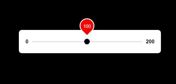
}Here is what our range slider looks like now:
The second to final step is to style our range input. To do this, we are going to use the pseudo-element -webkit-slider-thumb , which is the little round circle or groove (depending on your browser). This is to create uniformity across all browsers rather than just going with the default. We’re also going to make sure it’s a little circle through border-radius .
.range .field input{
-webkit-appearance: none;
height:3px;
background:#ddd;
border-radius: 5px;
outline:none;
border:none;
width:100%;
}
.range .field input::-webkit-slider-thumb{
-webkit-appearance: none;
height: 20px;
width: 20px;
background: black;
border-radius: 50%;
border: 1px solid #664AFF;
cursor: pointer;
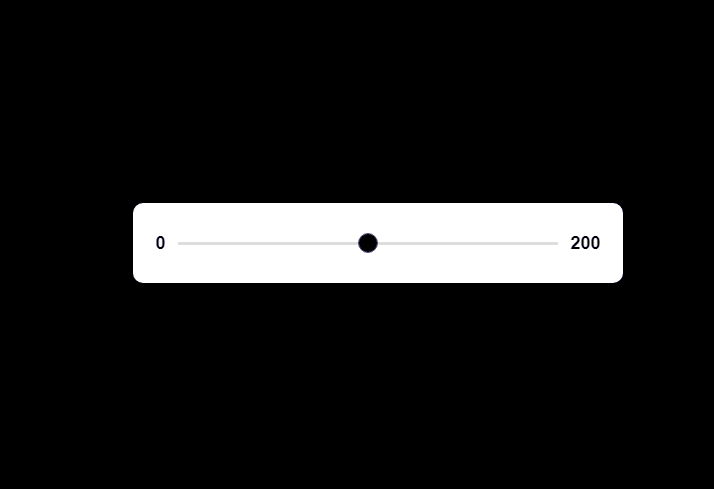
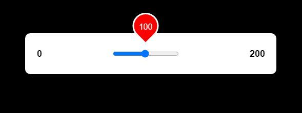
}Here’s what our range slider looks like now:
Currently, the number inside our teardrop doesn’t change when the range slider moves. We also want to hide it until it gets activated. To do this, we change our scale() at .range .sliderValue span from 1 to 0.
We are also going to add an extra selector called show to enact the transition animation and change our scale() from 0 to 1.
.range .sliderValue span.show{
  transform: translateX(-50%) scale(1);
}
Here is what our range slider looks like now:
Alright. It’s time to add some interactivity to it via JavaScript. Either inside the HTML and between <script> tags, or in a separate JavaScript file that gets imported in, we are going to write some JavaScript.
If we look at our slider and what we want it to do, what’s really happening is that we are targeting two specific elements — the input that is our slider and the span that holds our value.
To target them in JavaScript, we create the following constants:
const sliderValue = document.querySelector("span");
const inputSlider = document.querySelector("input");
Now it’s time to create our handler.
When our input (aka, the slider) is activated, this state is called oninput . Here, we can change the value by setting it to whatever the actual slider input value is through sliderValue.textContent = value;
We also want to move our teardrop around, which is achieved by figuring out the percentage value of what our slider is. For example, our max range is 200. If it’s at position 100, then it means that we are 50% to the left of the slider’s length. This is why our formula below is (value/2) + “%”
We also want to show our teardrop by attaching the class show to our span. When show is no longer needed, it is removed when the slider is not in focus (aka, onblur).
Here is the JavaScript for the above explanation.
inputSlider.oninput = (() =>{
      let value = inputSlider.value;
      sliderValue.textContent = value;
      sliderValue.style.left = (value/2) + "%";
      sliderValue.classList.add("show");
    })
inputSlider.onblur = (()=>{
      sliderValue.classList.remove("show");
    });
And that’s basically it! Here is the final result of the animated range slider implementation as per the above code.
Here is the final code for the HTML, CSS, and JavaScript.
The HTML:
<div class="range">
      <div class="sliderValue">
        <span>100</span>
      </div>
      <div class="field">
        <div class="value left">0</div>
        <input type="range" min="0" max="200" value="100" steps="1">
        <div class="value right">200</div>
      </div>
    </div>
The CSS:
*{
  margin:0;
  padding:0;
  font-family: 'Arial', sans-serif;
}
html, body{
  display:grid;
  height:100%;
  text-align:center;
  place-items:center;
  background:black;
}
.range{
  height: 80px;
  width: 380px;
  background:#fff;
  border-radius: 10px;
  padding: 0 65px 0 45px;
}
.range .sliderValue{
  position:relative;
  width:100%;
}
.range .sliderValue span{
  position: absolute;
  height:45px;
  width:380px;
  color: white;
  font-weight: 500;
  top: -40px;
  transform: translateX(-50%) scale(0);
  transform-origin: bottom;
  transition: transform 0.3s ease-in-out;
  line-height: 55px;
  z-index: 2;
}
.range .sliderValue span.show{
  transform: translateX(-50%) scale(1);
}
.range .sliderValue span:after{
  position: absolute;
  content: "";
  height:45px;
  width:45px;
  background: red;
  left:50%;
  transform: translateX(-50%) rotate(45deg);
  border:solid 3px #fff;
  z-index: -1;
  border-top-left-radius: 50%;
  border-top-right-radius: 50%;
  border-bottom-left-radius: 50%;
}
.range .field{
  position:relative;
  display:flex;
  align-items: center;
  justify-content: center;
  height: 100%;
}
.range .field .value{
  position:absolute;
  font-size:18px;
  font-weight:600;
  color: black;
}
.range .field .value.left{
  left: -22px;
}
.range .field .value.right{
  right: -43px;
}
.range .field input{
  -webkit-appearance: none;
  height:3px;
  background:#ddd;
  border-radius: 5px;
  outline:none;
  border:none;
  width:100%;
}
.range .field input::-webkit-slider-thumb{
  -webkit-appearance: none;
  height: 20px;
  width: 20px;
  background: black;
  border-radius: 50%;
  border: 1px solid #664AFF;
  cursor: pointer;
}
And the JavaScript:
const sliderValue = document.querySelector("span");
const inputSlider = document.querySelector("input");
inputSlider.oninput = (() =>{
      let value = inputSlider.value;
      sliderValue.textContent = value;
      sliderValue.style.left = (value/2) + "%";
      sliderValue.classList.add("show");
    })
inputSlider.onblur = (()=>{
      sliderValue.classList.remove("show");
    });